The Story That Fits on One Napkin
How many characters fit on a single square napkin handed out at a restaurant? Between the lie of dividing by area and the honest arithmetic of the floor function, this piece is about how a container called length reshapes the shape of a thought. It's the first entry in A Page for Today, a new series that opens an idea notebook at random.
I keep two idea notebooks on my desk. Books where words and sentences that inspire me are written down with no particular order. They're not books you read but books you open, so sometimes I just stick a finger in anywhere and let that be today's page. Where I opened it today, this was written:
Let's try laying a story onto a single square tissue of the kind restaurants hand out. It shouldn't overflow, and it shouldn't fall short either.
The line about not overflowing and not falling short stuck with me. Usually the agony of writing is 'what to write,' but this sentence nails down 'how much to write' before that question even comes up. Once the length is fixed first, the shape of the thinking changes. Like haiku living only within seventeen syllables, or old telegrams charging by the letter, when the container is small you end up ditching the broth first. A single napkin is that kind of container.
The idea that length shapes form isn't mine alone, as it turns out.
Constraints create form
Looking back, it's not rare at all for a narrow container to give birth to an entirely new form.
The 160 characters of a text message is one example. In 1985, an engineer drafting the telecom standard counted the sentences written on postcards and telexes and confirmed that most fit within 160 characters. That number became the ceiling for a single text message, and within it people invented a new way of speaking made of abbreviations and emoticons. Twitter's decision to cap posts at 140 characters for a while was likewise a byproduct of leaving room to fit a tweet into a single text message. A fence made of character count ended up changing how people wrote.
There are even narrower containers. The picture-book author Dr. Seuss made a bet with his publisher that he could write a book using fifty or fewer distinct words, and completed Green Eggs and Ham with exactly fifty words. With fewer words available to use, rhythm and repetition came alive instead, and the book became a classic that children read aloud on their own.
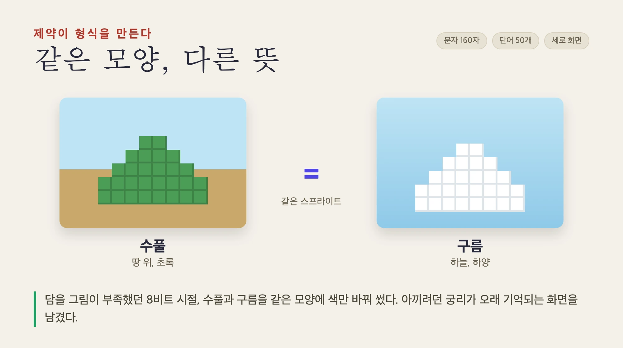
Constraints don't attach only to writing. When Nintendo was making Super Mario in 1985, the amount of art that could fit on a cartridge was small enough to count on one hand. So the developers drew bushes and clouds as the same shape and just changed the color, placing one on the ground and the other in the sky. An idea squeezed out of necessity became a scene that has lasted a long time.
It's close to home, too. The tall, vertically scrolling screen of Korean webtoons was born not from the printed page but from a screen that flows up and down. Once panels flowed downward instead of turning sideways, even the speed of the finger scrolling became part of the direction. The constraint of a narrow screen rewrote the grammar of comics.
What all these stories share is one thing. The container was decided first, and the answer came from within it. An answer that never would have emerged had a wide sheet of paper been given instead.
Dividing by area tells a lie
So I decided to measure my own napkin. Just how many characters actually fit on this one sheet?
The easiest answer is to divide by area. Say the square napkin commonly handed out at restaurants is 150mm on each side, and a single character written comfortably by hand takes up 9mm wide by 12mm tall. Set aside a 10mm margin on each edge for the hand to pass through.
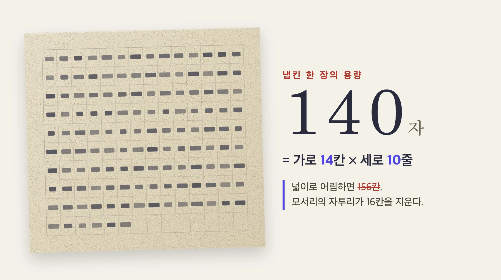
The usable area is 130 × 130, or 16,900mm². A single character cell is 9 × 12 = 108mm². Divide the two and you get about 156 characters.
But that number, 156, is a lie. Area is a value that mashes characters together like porridge, assuming an arrangement that never actually occurs in reality. On an actual sheet of paper, characters sit in rows, and they don't get sliced in half at the edge. Even if the calculation says 14.4 characters fit in a row, what we can actually use is 14. The 0.4 is discarded. The same goes for rows.
So the honest calculation divides first and multiplies second.
한 줄 글자수  cols = ⌊130 / 9⌋  = 14
줄     수  rows = ⌊130 / 12⌋ = 10
한 장 용량   N    = 14 × 10     = 140자
⌊ ⌋ is the floor function, which cuts off anything past the decimal point. 156 from the area calculation versus 140 from the honest calculation. That gap of 16 characters is precisely the value of the fact that 'reality is not continuous.' A great deal of the world's waste is born right there. You'd think rounding by average would do, but in practice the scraps quietly fall away in every row, every cell.
The conclusion is this: a single napkin holds roughly 140 characters. This very paragraph in this very piece happens to be just about that length. Fewer than you'd think. And yet that's enough to hold most of what you meant to say.
From formula, by hand, to screen
Once I had the number, it felt like a waste to leave it only on paper. So I carried this formula straight into a web app. Change the napkin size or the character size, and the capacity N recalculates in real time, with the character count I've typed tracking along beneath it. Fill less than 60% and it reads "Too short — the napkin feels empty." Pass 85% and it reads "Just right — it fits the sheet." Go over 100% and it reads "Overflow — it's spilled past the napkin." A single bar enforces today's rule of not overflowing and not falling short, in my place.
The fun part came after that. I thought it would be nice if it looked like an actual napkin sitting on a restaurant table, and could be posted straight to Instagram as is. Here I borrow one small principle: instead of drawing the grain of the paper and the stains on a stone table, I fake them. A function called feTurbulence generates cloud-like patterns from random noise, and when you strip the saturation to zero and lay it on very faintly, human eyes read it as the grain of paper fiber and stone. It's really just rule-less noise, but our eyes go ahead and attach the meaning of 'texture' to it on their own.
One thing I wanted to make clear: the handwriting is text I typed myself, not a sentence a machine made up in my place. What the AI generates is the grain of the napkin, the shadow of the table, even the faint watermark stamped in the middle. The background can be dressed up, but the words have to be mine. That line holds even at the moment the image is exported as a photo.
The practice of paring down
I spent half a day building this tool, but what I learned today fits in one line. Decide the container first, and what to cut becomes visible.
140 characters isn't generous. So in front of a napkin, the conjunctions go first. Adjectives that don't need to be there, things said twice, sentences added just to sound impressive — these get pushed out first. What's left is what you meant to say. Maybe good writing isn't about greedily chasing the 156 characters estimated by area, but about honestly knowing the 140 that remain.
That's how A Page for Today begins. Opening the two notebooks at random, and laying that day's thought onto whatever fragment turns up there. Not overflowing, but not left feeling empty either. As much as fits on a single napkin.