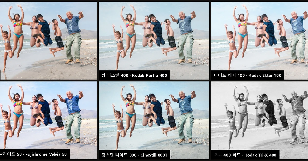
A One-Click Film Camera Built by Reading 1,027 Film Photos — Twenty Film Looks, and the Films the Samples Could Never Tell Apart
I gathered public sample photos of films like Portra, Velvia, and Tri-X, measured their differences in color and tone, and built an app that turns one photo into twenty film looks at once. Tone followed the samples. But color casts followed whoever scanned the film, not the film itself, and four slide films couldn't be told apart from samples alone.
People who shoot Fujifilm cameras like to say half the fun is picking a "film simulation." Canon has Picture Styles; Nikon has Imaging Recipes. Lightroom and VSCO offer hundreds of presets named after film stocks, and even the portrait-retouching app Evoto will transfer the color of a reference photo. One button, and a digital photo looks as if it were shot on some film.
But what exactly is that "like some film" matched against? I got curious and decided to try it myself. There are tens of thousands of photos online whose owners say they were shot on Portra 400 or Velvia 50. If you collected them and fed them to a machine, wouldn't you get numbers for how each film's color and tone differ from digital?
What I set out to do
There were three goals.
- Survey the techniques for making film looks, from both research papers and real products.
- For films that were actually sold and have plenty of sample photos online, build looks from data extracted from those samples.
- Build a web app that converts one uploaded photo into many film looks at once, and run it on my own PC.
For the research, the AI spun off two helper tasks, one covering papers and one covering products. Meanwhile, the main task collected samples and wrote the analyzer. From the start to a working app and a draft of this post took a little over an hour, and about half of that was spent downloading samples. The public image search service only allows anonymous users 20 searches a minute and 200 a day, so there was no way to go faster.
What came out
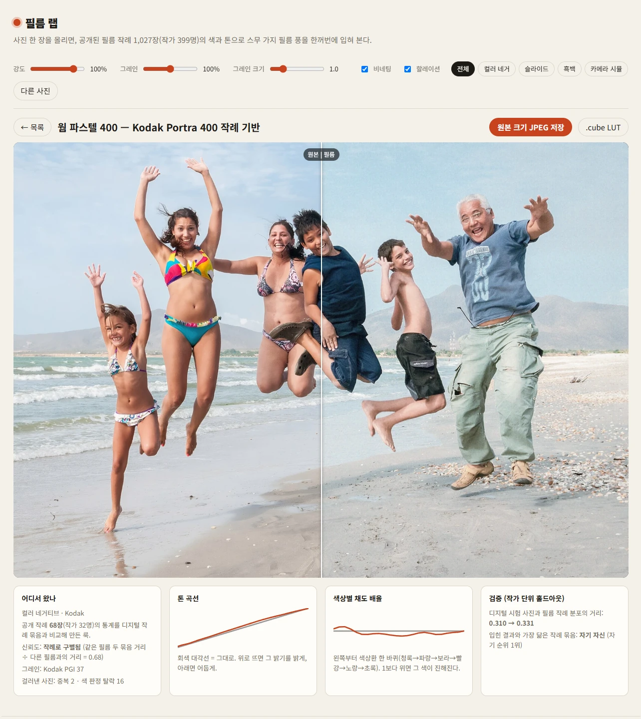
Drag a photo in, and twenty film looks fill the screen. Click one to place it beside the original and drag a line to compare. You can save it at full resolution or download the look as a LUT file (.cube). A LUT is a color lookup table that says "when this color comes in, send that color out." You can drop it straight into editors like DaVinci Resolve or darktable.
Photos never leave the browser. The color transform and grain are all computed in the browser by my own PC's graphics card. Move the strength or grain slider and all twenty images redraw on the spot.
Here are the twenty.
| Group | Look (film the samples came from) |
|---|---|
| Color negative | Kodak Portra 160·400·800, Ektar 100, Gold 200, UltraMax 400, Fujicolor Superia 400·Pro 400H·C200, CineStill 800T·50D |
| Slide | Fujichrome Velvia 50·Provia 100F, Kodak Ektachrome E100, Kodachrome 64 |
| Black and white | Ilford HP5 Plus·Delta 3200, Kodak Tri-X 400 |
| In-camera film sim | Fuji Classic Chrome, Classic Neg. |
The app's cards don't use the film names directly. Each carries a name I made up, like "Warm Pastel 400" or "Landscape Slide 50," with only a note of where it came from, such as "68 Kodak Portra 400 samples." Camera makers customarily avoid using other manufacturers' film names as preset names. At the bottom of the app, I added a line saying that film names belong to their trademark owners and that these are not official reproductions.
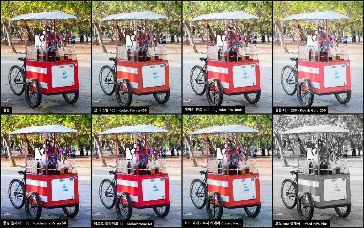
I tried it on other photos too.
Some of the differences read from the samples matched the impressions film photographers have long passed along by word of mouth. I measured the average saturation of each photo and took the median for each group. Against 0.038 for the digital samples, Velvia 50 was the most saturated at 0.053, and Portra 400 came in below digital at 0.032. That fits their reputations exactly: a high-saturation film for landscapes and a soft film for portraits. But not everything matched. Ektar 100, sold on its vivid color, came in at 0.039, almost the same as digital.
How it worked
- Collecting samples. I searched by film name on Openverse (a public search over Flickr's CC-licensed photos) and Wikimedia Commons. I downloaded 24 films plus digital camera photos to serve as the baseline. Photos that imitated film with presets, expired film, cross-processing, and photos of film boxes were filtered out by title and tags.
- Not letting one person drive the average. I used at most 6 photos per uploader per film. The point was to keep one person's scanner and editing habits from looking like the film's color. I also sampled the same number of pixels from each photo so larger photos didn't get a louder voice.
- Turning the difference between two groups into a lookup table. There are no paired photos. If you had the same scene shot on digital and film at once, you could match colors one to one, but online samples don't work that way. So I solved for "a transform that moves the color distribution of the digital group onto that of the film group." This is a method published by Pitié et al. in 2005: rotate the color space in random directions and match the distribution one axis at a time, over and over. I baked the resulting transform into a 33×33×33 lookup table. For black and white, only the luminance curve and the remaining tint were transferred.
- Validating by person. I split the samples in two by uploader. I built the look from one half only, applied it to 60 digital test photos, and measured whether they moved closer to the samples from people not used in training. If the same person's photos end up on both sides, you mistake matching that person's habits for matching the film.
What remained was 1,027 samples from 286 uploaders.
Where it went wrong
First, grain couldn't be measured from the samples. The original plan was to measure grain strength from the samples as well. I picked the smoothest area of each photo (somewhere like the sky) and measured the size of the fine fluctuations. The result was 0.0028 for film and 0.0026 for digital: effectively the same. Portra 160 came out at 0.0022, lower even than digital.
Film photos posted online were scanned at thousands of pixels, shrunk to 1,024 pixels, and then compressed as JPEG. Shrinking smears the grain, and compression erases what's left. The fluctuation that survives at that size isn't film grain. It's digital noise and compression artifacts.
So I turned to manufacturer datasheets for grain. Kodak specifies color negative grain as a "Print Grain Index." Portra 160 is 28, Portra 400 is 37, Portra 800 is 48. Slide and black-and-white films are specified in diffuse RMS granularity: Velvia 50 is 9, Tri-X 400 is 17. The two scales can't be compared with each other, so I mapped each one separately to a score between 0 and 1. That conversion was fitted by eye. Ilford doesn't publish granularity figures for HP5 Plus or Delta 3200 at all, and Fuji's three negative films all have a datasheet value of 4, which is useless for telling them apart. For those, I estimated from ISO. Each look in the app notes where its grain came from.
Second, the first method was too weak. At first I measured the difference in pieces. I built a tone curve from the difference in luminance distributions, then separately computed which way color leaned in each luminance band and how saturation differed by hue, and combined them. When I applied the Portra 400 look, it was almost indistinguishable from the original. I had used medians and trimmed extreme values to reduce the bias from scene content, and in doing so, I had shaved off the film's character too.
So I switched to moving the whole color distribution at once (the Pitié method mentioned above). This time, Portra 400, 160, and 800 became noticeably different from one another. But push the transfer too hard and you carry over the scenes in the sample group as well. I ran the original settings (24 iterations, 60% per step) and a weaker setting (10 iterations, 35% per step) through validation, and chose the weaker one, which better matched the held-out samples.
Third, only tone carried over. The validation results are the most important numbers in this post.
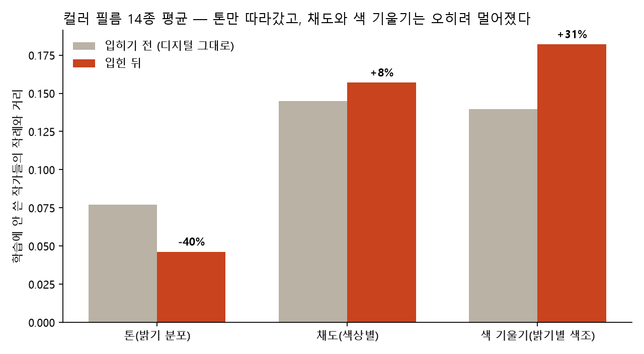
Averaged across 14 color films, digital photos with the look applied moved 40% closer to held-out uploaders' samples in luminance distribution. But saturation actually moved 8% further away, and the direction color leans at each luminance level (the color cast) moved 31% further away. Even with the weaker first method, the color cast moved 26% further away. Changing the method didn't change the outcome.
Film's tendency to lift shadows and gently compress highlights survives no matter who scanned it. But whether a photo leans yellow or blue is decided less by the film than by the lab, the scanner, and the uploader's white balance. The color cast learned from one half's samples didn't fit the other half.
Asking "which film's samples does the result look most like?" gave the same answer. Of the 14 color films, only 5 ended up looking most like their own film's samples.
At first I misread this. When I averaged in the black-and-white films, saturation appeared to move 26% closer. A black-and-white look drives saturation to zero, so of course it's close to black-and-white samples. Taking those out and recomputing gave the numbers above.
Fourth, half of the films couldn't be told apart from samples. Then I had to separate two questions: was my method bad, or did the samples simply not contain the information to distinguish the films? I split each film's samples in two by uploader and compared the distance between the two halves with the distance to other films. Only if same-film halves are clearly closer is that film's character actually in the samples.
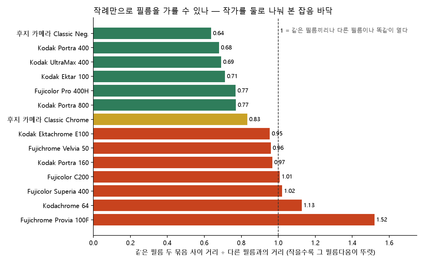
Only 6 of the 14 had same-film halves clearly closer together. For all four slide films (Velvia, Provia, Ektachrome, Kodachrome), two halves of the same film were as far apart as different films. For Provia 100F, the same film's halves were actually 1.5 times further apart. Slides are tricky to scan to begin with, and the Kodachrome samples include scans of old slides faded over decades. And the Velvia samples are almost all landscapes. There's no way to tell whether the samples are telling you about the film or about the subject.
I put these results straight into the app. The seven red looks carry a warning mark on their cards, and the detail view says "not distinguishable from samples." I considered dropping them. But these looks are honestly "the average of photos posted as that film." There's just no basis for calling that a property of the film.
Fifth, four films didn't have enough samples. ColorPlus 200 (18), Lomography 800 (22), Fuji's Eterna simulation (9), and Fuji's Acros simulation (0) fell short of the 25-photo threshold and were dropped. When I narrowed the search for Acros to "Acros simulation," there were only 8 candidates, and even those were photos shot on actual Acros 100 film, so they were filtered out. Fuji's film simulations are an in-camera feature, so few people write the name in their photo titles.
Sixth, one in ten color film samples was black and white. Searching by color film names turned up black-and-white photos: shot on color film, converted to black and white, then posted. Removing photos with average saturation near zero took 80 photos out of 15 color films, 16 from Portra 400 alone. Even the digital baseline group had 33 black-and-white photos out of 160.
Seventh, halation was added by hand. CineStill 800T is famous for the red glow around bright lights. That's because the layer that prevents light bleed has been stripped from a motion picture film so it can be developed at an ordinary lab. The glow only appears around lights in night scenes, so it doesn't show up in color statistics across all the samples. So I built a separate effect that blurs bright areas and lays them back in red, applied it only to the two CineStill looks, and noted in the app that "a property from the literature was added by hand."
How others do it
My research found four broad ways to make film looks.
- Measure the real thing. Dehancer says it shoots film at three exposures, hand-prints it, and measures the prints with a spectrophotometer to build its profiles. FilmConvert reportedly shoots the same charts and scenes side by side on digital and film for each camera, and scans real film at 6K for its grain.
- Lay it beside scans and match by hand. VSCO, RNI, and Mastin Labs are in this group. VSCO gives its presets abbreviations like KP4 instead of film names and notes in the description that they're "modeled after Kodak Portra 400."
- Camera makers know their own film. According to Fujifilm, its film simulations began with the color modes of the FinePix F700 in 2003. Classic Chrome (2014), Acros (2016), Eterna (2018), Classic Neg. (2019), Nostalgic Neg. (2021), and Reala Ace (2023) followed. Other camera makers don't use anyone else's film names. Ricoh says "positive film"; Sony uses English abbreviations.
- Transfer color from a reference photo. Photoshop's color matching and Evoto's AI color matching fall here. Academically, the starting point is Reinhard et al.'s 2001 color transfer paper, and the Pitié method I used belongs to the same line.
What I did was apply the fourth approach to hundreds of samples. This time I learned firsthand why Dehancer and FilmConvert go to the trouble of shooting and measuring real film. Without paired data, the film's properties, the scene, and the scanner's habits are tangled together and can't be pulled apart. Even Dehancer notes that the same film varies with manufacturing date, development, and scanning, so its own profiles aren't an absolute standard.
Why one line is enough
Nearly all the ingredients are public: a public search that finds CC-licensed samples, color transfer papers, manufacturer datasheet PDFs, even a standard for using the graphics card from the browser (WebGL). For a person, collecting samples, finding and reading papers, and writing shaders would take days. The AI did it in a little over an hour, helped by running the two research threads separately while the main work went on at the same time.
But once again, what one line delivered was only the app's surface. Whether the looks could be trusted was settled by validation. That grain couldn't be measured, that color casts didn't generalize, that the four slide films couldn't be told apart: all of it became visible only after the numbers were out. Without validation, I would have labeled all twenty looks as their films.
If you want to try this
- Split validation by person. If you split photos randomly in half, the same person's photos land on both sides and inflate the score. Split by uploader.
- Measure the noise floor first. If "the difference within the same thing" is as large as "the difference from other things," no method, however good, can separate them with that data. Checking this before fixing the method saves time.
- Take out what's mixed in before averaging. Including black and white in the average made the color results look good. You need the habit of re-checking by component and by group.
- What data can't measure, add by hand and state the source. Grain and halation were like that. Don't mix them in and pretend you measured everything.
What it can't do
- It doesn't reproduce film. The looks in this app transfer "the color distribution of photos posted as shot on that film." That's film + development + scanning + editing combined. It's not the film's own response.
- Half can't be told apart from samples. The four slide films, plus Portra 160, Superia 400, and C200, had samples of the same film as far apart as different films. Treat those looks as reference only.
- Color casts don't match. If a result comes out too yellow or too blue, lower the strength slider or reset white balance in your editor.
- Grain strength uses a conversion fitted by eye. The datasheet figures are real, but the formula that turns them into on-screen grain size is my own.
- It doesn't consider the scene. There's no feature that protects only skin or treats only the sky. The same transform applies to the whole photo.
Every time I saw a preset named after a film, I used to ask, "Does it really look like that film?" After trying this, the question changed. The color we remember from that film had the neighborhood lab's scanner and the hand of whoever posted the photo in it too.
If you enjoyed this, please leave a comment.
Sources
- Samples: Openverse (CC-licensed Flickr images) and Wikimedia Commons. Used only for statistical analysis; images were not redistributed
- Sample photos: Wilfredor, CC0 1.0 (Wikimedia Commons, "Peoples jumping in La Guardia beach" and "Ice cream truck selling brushed")
- Color distribution transfer: F. Pitié, A. Kokaram, R. Dahyot, "N-Dimensional Probability Density Function Transfer and Its Application to Colour Transfer", ICCV 2005
- Color transfer: E. Reinhard et al., "Color Transfer between Images", IEEE Computer Graphics and Applications, 2001
- Granularity: Kodak datasheets E-4050 (Portra 400), E-4051 (Portra 160), E-4040 (Portra 800), E-4046 (Ektar 100), F-4017 (Tri-X 400); Fujifilm AF3-0221E2 (Velvia 50), AF3-036E (Provia 100F)
- Fujifilm film simulation history: fujifilm-x.com "The World of Film Simulation", FujiRumors timeline
- How Dehancer, FilmConvert, and VSCO make their looks: each company's official descriptions